So, you’ve decided it’s finally time to launch a website to show off your professional skills or your side hustle. In preparation, you nabbed the perfect domain, signed up for a website-building service, picked the right template, and drafted some award-winning copy to throw up there. And now you’re staring at your big, beautiful, blank website. Emphasis on the blank.
Despite how easy so many online platforms are making building a website these days, staring at an empty page still probably makes your head spin. After all, there are still some things you have to figure out—like which photos to include and how to lay out the page—and if you don’t have much web design knowledge, the process can seem seriously intimidating.
We’re here to tell you that you’ve got this. To make pulling a beautiful website together a breeze, we’ve come up with the ultimate toolkit that will walk you through all the elements you’ll need to get your site up and running, along with our favorite programs and pro tips for making them awesome.
1. The Images

You’ve surely heard the saying, “pictures are worth a thousand words.” This rings especially true when it comes to digital content; the more you can convey through eye-catching imagery, the less text you’ll need to use to describe what you’re trying to say or sell.
Start by thinking about yourself and your work. Do you have a professional photo you can use? If not, find a friend and try your hand at taking your own, or consider hiring a professional. Do you have photos or screenshots of work you’ve done in the past? Collect them up. How about photos you love and have shared on Instagram that represent your work or personality? Pick out a few of your favorites.
If you need filler, stock images are the way to go. Unsplash and StockSnap.io are some of our favorite attribution-free options (meaning you can use them for free to your heart’s content). If you’re not finding what you’re looking for, you might consider paying for one or two perfect pics. There are tons of options out there, from large stock image sites like Getty Images—which has an integration with Squarespace offering $10 images to people who buy through the site—to smaller operations like Stocksy and Twenty20 where the cost is usually around $10-$25 per image.
When choosing these photos, think imagery that reflects your personality or the things you spend every day doing. Do you, like most of us, sit at a desk all day? Look for a desk photo that fits your personality. Does your primary work involve people? Look for shots showing groups collaborating. Do you talk all about your passion for travel? Look for some stunning photography of your favorite destinations. You could even decide to use a video as your background image if that makes sense for the work you do!
Chances are that at some point or another, you’ll want to edit images you already have or have found online. Get to cropping, lightening, touch-ups, and even adding text or graphics with a simple image editor. Some website design services—Squarespace included—have an image editor available as part of the platform. Otherwise, there are plenty of free or cheap options online. PicMonkey offers a full set of features for $5/month, which range from easy to use teeth-whitening to makeup effects for your headshot to photo filters, frames, and more.
Further Reading: 50 Free Photos You Can Use to Make Your Social Profiles More Stunning
2. The Color Palette

Many website templates come with a pre-set color scheme, so if you like what you’re given, feel free to skip this section. But, since colors are an easy way to add a little personality to your site, you might choose to change them.
Whether you like black and white with a pop of brightness or want a smattering of go-together shades on your site, coolors.co is a great resource for identifying colors that’ll work together. It’s super easy to use—just visit the site and hit the spacebar until you stumble upon a set of hues that you like. You can even upload photos with colors you love and get swatches directly from them. If you’re including lots of images on your site, this could be a good strategy to be sure your color scheme works overall. Another surprising place to find colors that work well together and represent you? Your closet! Pull out some of your favorite threads and match your color choices to those.
To keep things from getting visually overwhelming, we recommend picking a mostly neutral palette with one to two accent colors. For an easy go-to, try a few shades of gray plus your favorite color and its complementary hue (for example, light gray, medium gray, dark gray, orange, and blue). Once you love what you’ve put together, export the palette as a whole or copy the color codes for specific swatches you like and paste them directly into your site code or built-in style editor.
Further Reading: Color Theory For Designers: Creating Your Own Color Palettes
3. The Fonts

Typefaces can make a huge difference when it comes to a stylish and easy-to-read website. Though they seem simple in nature, there are heaps of things you can do with lettering to help take the look and feel of your written content to a new level.
Again, many website templates come with pre-set fonts, but if you want to change things up fontpair.co is an easy solution for finding fonts that will give your site some professional-looking pizazz. Scroll through handpicked designer duos to pinpoint a good pair (and definitely stick to just one or two fonts site-wide to prevent things from looking messy).
A word of warning here—while it can be tempting to pick something fun or different, you should follow the same principle as you do when choosing fonts on your resume and make sure everything is professional and readable. If you really want to include a cursive or unique font, play with putting it in just one place as a graphic element (in your header, for example) and keeping the rest of the text more basic.
Further Reading: 20 Best and Worst Fonts to Use on Your Resume (Or Personal Site)
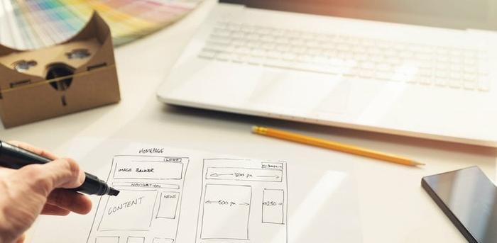
4. The Page Layout

Now you’ve picked everything out—but where do you put it all on the page? Organizing lots of content and making it look intentional can be tough if you’re unfamiliar with web design, but there are plenty of ways to get up to speed quickly.
If you’re building your site on Squarespace, you’ll appreciate the company’s starter layouts, which offer templates optimized for everything from your about page to a contact page. From there, you can plug your content right in or move element blocks around to meet your needs.
Another great place to get inspiration for your layout is other people’s sites! Imitation is the best form of flattery, so find folks you think have organized their sites well and try to mimic the elements you like about them. Or, search terms like “website design” and “website layout” on Pinterest to collect examples you can replicate on your own.
Further Reading: The 35 Best Personal Websites We’ve Ever Seen
5. The Logo

Unless you’re a design professional, you don’t really need a logo, but it can be a memorable part of your branding that you can use everywhere from your website to your social media profiles to your resume and business cards. Though some logos require special touches or talent, like pattern, texture, or handlettering, other beautiful and clean designs can be created with a mix of typefaces, a couple colors, and a simple icon that fits your brand.
Despite what you might believe, you actually don’t need a professional program or a design background to create something that will work for your digital presence. Squarespace users have access to a built-in logo designer that will showcase your site title, as well as a tagline and an icon if you’d like. If you’re not a Squarespace customer, you can still use the tool and pay $10 per logo, or use a platform like Canva to design something that’ll work for your brand. If you want something truly unique, paying a professional is a solid option.
To create a logo that speaks to you and your work, first decide what you're trying to convey. Is it your products, your brand personality, or an emotion? Once you've nailed it down, decide whether you'll opt for just typography or include a symbol as well. From there, play with typefaces and icons to get the shape right before incorporating color. It may take several iterations, but you should be able to come up with something simple and relevant to represent your brand.
Do note that today, logos appear in many places across a heap of mediums. Pay attention to how yours looks in different sizes, in print (for your business card and marketing collateral), on social sites, and against a variety of backgrounds (for example, dark, light, and transparent).
You can also use your logo as your favicon (the tiny icon that appears in your browser tab)—or adjust it to a simpler version to use there. Not only does a favicon help your visitor identify you, but it also ups your cred by adding a branded bit of polish. On Squarespace, any image you upload will be formatted automatically, or you can create one using favicon.cc.
Further Reading: 7 Killer Tips for Logo Design
If you’re reading all of this and thinking that it sounds like a lot, don’t worry—you don’t have to do it all in one sitting. In fact, it might be helpful to come back to your work a couple of times, so that you see it with fresh eyes. Still not sure if it’s coming together? Share it with a few friends to get their feedback. Is it communicating what you’d like it to, visually? Does it look like you? If not, don’t be afraid to keep tinkering until you have something you truly love.